


Active Topics
-
Maemo repository (8)
to Community by Maemish - 20 hrs, 13 mins ago -
Porting apps to Leste (44)
to Maemo 7 / Leste by norayr - 1 day ago -
List of well performing apps on Leste (35)
to Maemo 7 / Leste by smatkovi - 3 days, 22 hrs ago -
Sailfish OS for the Motorola Moto G7 Power (XT1955-5) - (ocean) (13)
to SailfishOS by edp17 - 4 days, 20 hrs ago -
Sailfish OS for the Samsung Galaxy Note 4 (SM-N910C) - (treltexx) (79)
to SailfishOS by edp17 - 4 days, 20 hrs ago -
U-Boot for Nokia RX-51 with BootMenu (updated version 2012.10-rc3-1) (843)
to Alternatives by Arno_11 - 5 days, 1 hr ago - more...

| The Following 6 Users Say Thank You to rinigus For This Useful Post: | ||
 |

|
2019-03-07
, 10:01
|
|
Community Council |
Posts: 1,669 |
Thanked: 10,227 times |
Joined on Nov 2014
@ Lower Rhine
|
#472
|
Originally Posted by Fellfrosch

Using a bold black background we are losing infos
Originally Posted by XOleg
With only one click/tap to the map the the icons are moved off screen if the user needs them out of the way? Couldn't you say the same about the whole landscape view then?
But maybe it's better without enormous black background for smartphone?
Originally Posted by Fellfrosch
I do not like the vertical size difference for one.
Alll in all I'm not so sure if we really need a complete new icon set. I looked at the in app icons and they looked to me quite consistent.

__________________
Watch our weird watchfaces for mighty AsteroidOS
Performance comparison Video Sailfish 2.0 vs 1.1.9 vs 1.1.7
[MC eV] Maemo Community eV membership application please concider to join!
Watch our weird watchfaces for mighty AsteroidOS
Performance comparison Video Sailfish 2.0 vs 1.1.9 vs 1.1.7
[MC eV] Maemo Community eV membership application please concider to join!
| The Following 3 Users Say Thank You to mosen For This Useful Post: | ||
 |
|
2019-03-07
, 10:03
|
|
Posts: 1,092 |
Thanked: 4,997 times |
Joined on Dec 2009
@ beautiful cave
|
#473
|
There is nothing to say against backgrounds, but in my opinion they shouldn't be opaque but halt transparent. So you can achieve both: Don't lose data (even so it is harder to see them) with better readability of the icons. Bringing it to the edge, the background transparancy could be adjustable via settings.
I already pointed out, that @mosen did already make an, at least for me, nearly perfect proposal:
http://talk.maemo.org/showpost.php?p...&postcount=378
(Here for me also the search icon was great - especially with breaking out from that background )
)
I already pointed out, that @mosen did already make an, at least for me, nearly perfect proposal:
http://talk.maemo.org/showpost.php?p...&postcount=378
(Here for me also the search icon was great - especially with breaking out from that background
)
| The Following 4 Users Say Thank You to Fellfrosch For This Useful Post: | ||
|
|
2019-03-07
, 10:06
|
|
Posts: 1,092 |
Thanked: 4,997 times |
Joined on Dec 2009
@ beautiful cave
|
#474
|
Originally Posted by mosen
That's why I said, the center button in menu view doesn't work for me as well.
I do not like the vertical size difference for one.
The others are OPTICAL of the same size.
| The Following 3 Users Say Thank You to Fellfrosch For This Useful Post: | ||
|
|
2019-03-07
, 10:15
|
|
Posts: 1,092 |
Thanked: 4,997 times |
Joined on Dec 2009
@ beautiful cave
|
#475
|
Originally Posted by mosen
You don't speak about the landscape view, but about the Navigation mode (also black background in portrait mode). Here for me the navigation instructions are the most important thing. So the black background is for me absolutely no problem.
With only one click/tap to the map the the icons are moved off screen if the user needs them out of the way? Couldn't you say the same about the whole landscape view then?
/url]
| The Following 3 Users Say Thank You to Fellfrosch For This Useful Post: | ||
|
|
2019-03-07
, 10:23
|
|
Posts: 1,414 |
Thanked: 7,547 times |
Joined on Aug 2016
@ Estonia
|
#476
|
Originally Posted by Fellfrosch
Breaking out is not trivial to do, would much more prefer background surrounding icon fully. For simplicity on my side
I already pointed out, that @mosen did already make an, at least for me, nearly perfect proposal:
http://talk.maemo.org/showpost.php?p...&postcount=378
(Here for me also the search icon was great - especially with breaking out from that background
| The Following 6 Users Say Thank You to rinigus For This Useful Post: | ||
|
|
2019-03-07
, 12:55
|
|
Posts: 1,414 |
Thanked: 7,547 times |
Joined on Aug 2016
@ Estonia
|
#477
|
Forgot to mention earlier: with the backgrounds enforced, we can probably use smaller icons for buttons.
| The Following 4 Users Say Thank You to rinigus For This Useful Post: | ||
 |
|
2019-03-07
, 13:50
|
|
Posts: 175 |
Thanked: 515 times |
Joined on Jul 2018
@ Guatemala
|
#478
|
i think it need start from the p.m main icon, like removing the point of center, then leave just the world, it which be the same visual and bettttter.
__________________
Nokia N95 / Nokia N900 / Nokia N9 / Nokia N8 / Jolla 1 / Jolla C / Xperia X / Xperia 10 II / PinePhone / Librem 5 / Xperia 10 III / Xperia IV
Nokia N95 / Nokia N900 / Nokia N9 / Nokia N8 / Jolla 1 / Jolla C / Xperia X / Xperia 10 II / PinePhone / Librem 5 / Xperia 10 III / Xperia IV
|
|
2019-03-07
, 15:15
|
|
Posts: 1,092 |
Thanked: 4,997 times |
Joined on Dec 2009
@ beautiful cave
|
#479
|
Originally Posted by carlosgonz
This is not part of the discussion anymore, because we already discussed it. @Rinigus will check with Otsaloma if we are allowed to use this icon:
i think it need start from the p.m main icon, like removing the point of center, then leave just the world, it which be the same visual and bettttter.
http://talk.maemo.org/showpost.php?p...&postcount=454
If so we will switch to it.
More important is the in app design and here basically the usability and consistency of the design.
| The Following 6 Users Say Thank You to Fellfrosch For This Useful Post: | ||
 |
|
2019-03-08
, 19:12
|
|
Posts: 764 |
Thanked: 2,889 times |
Joined on Jun 2014
|
#480
|
Oh, I just noticed a minor issue. Using a light theme, the text 'Pure Maps' on the cover is almost invisible. This is partially because light themes aren't optimised yet (lots of light colours on light backgrounds), but looking at Jolla's own applications, they usually use white/black text on their covers instead of the theme-dependent colours, so I think it would make sense to do it the same way for Pure Maps. OSM Scout Server already uses white/black text on the cover, too.
| The Following 7 Users Say Thank You to nthn For This Useful Post: | ||


I'll try to catch up, but it may take some time.
Re Pure Maps icon in https://talk.maemo.org/showpost.php?...&postcount=454 : notice similarity with WhoGo Maps icon. Not sure whether we can use it, probably should get thumbs up from @otsaloma. Taking into account that WhoGo Maps is archived, its probably OK though.
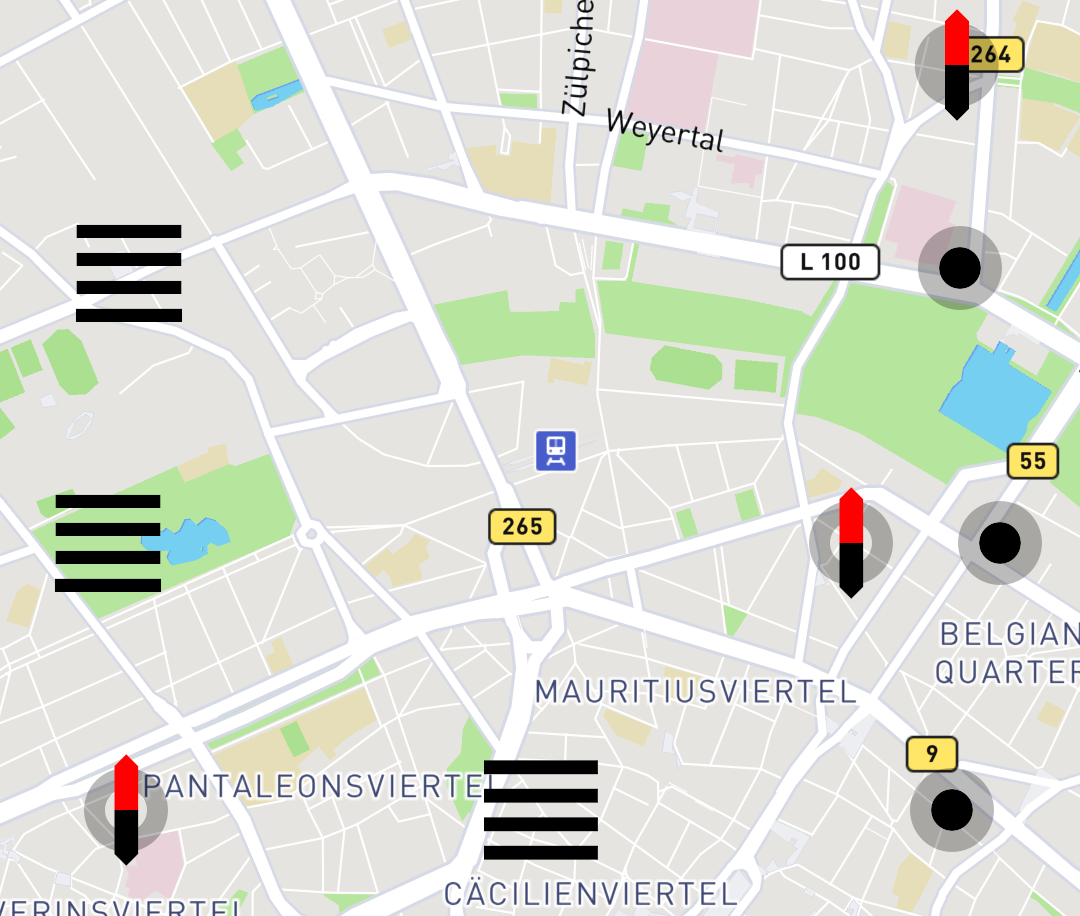
Re backgrounds and loosing data under the buttons: I suspect, that its a way to go. Have had exactly the same concerns as @Fellfrosch (loosing data) and @mosen (can't see thinner lines) have, quite schizophrenic situation. Problem is that maps have icons as well and we may want to visually distinguish the clickable command icons from map layer. Google, Here, and Apple use backgrounds despite loosing ability to show data below. This is a strong hint that the designers and larger scale UX studies suggested it.
I presume, we will end up with the following list of buttons:
* menu
* search
* route
* compass
* center
* map layers
* zoom in
* zoom out
* scalebar
While scalebar will probably stay as it is, its actually a button allowing you to toggle autozoom on/off.
The three buttons above scalebar in the list are not there yet, but will probably get implemented in future (zoom ones for simple zooming while in navigation mode mainly).
So, we do have a largish list and that's why it was important to get the minimal view mode allowing you to choose the "favorite" ones and keep them on all the time.
With the buttons, assuming that they will get backgrounds, there are few important technical aspects:
- we would probably set background/foreground for each map separately. It looks to me that the theme colors are not good for it and we better use the same approach as used for the current street name.
- buttons can consist of three areas, nested into each other.
1: clickable area, the largest, to ensure that its easy to click
2: background area (circle, rectange with roundish corners)
3: icon, in the middle of area 2
currently, 1 and 3 are already there.
We can probably add shadow for buttons as well, if needed/desired. Would have to see if its possible with oldish Qt/QML in SFOS though.