


Active Topics
-
Maemo repository (8)
to Community by Maemish - 13 hrs, 54 mins ago -
Porting apps to Leste (44)
to Maemo 7 / Leste by norayr - 18 hrs, 27 mins ago -
List of well performing apps on Leste (35)
to Maemo 7 / Leste by smatkovi - 3 days, 15 hrs ago -
Sailfish OS for the Motorola Moto G7 Power (XT1955-5) - (ocean) (13)
to SailfishOS by edp17 - 4 days, 13 hrs ago -
Sailfish OS for the Samsung Galaxy Note 4 (SM-N910C) - (treltexx) (79)
to SailfishOS by edp17 - 4 days, 13 hrs ago -
U-Boot for Nokia RX-51 with BootMenu (updated version 2012.10-rc3-1) (843)
to Alternatives by Arno_11 - 4 days, 19 hrs ago - more...

| The Following 3 Users Say Thank You to mosen For This Useful Post: | ||
 |

|
2019-03-05
, 12:27
|
|
Community Council |
Posts: 1,669 |
Thanked: 10,227 times |
Joined on Nov 2014
@ Lower Rhine
|
#452
|
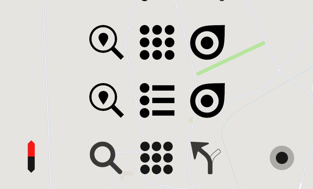
Advancing the "pure" rule to the route and search icon:
I try to pick up what the user will see while using the app/map and announce them already within related icons. Thus the search icon contains the poi/route-end sign.
Not completely satisfied with "weight" distribution of the 3 icons though. the search still looks too thin. Or the route marker is too heavy. Gonna try more.
__________________
Watch our weird watchfaces for mighty AsteroidOS
Performance comparison Video Sailfish 2.0 vs 1.1.9 vs 1.1.7
[MC eV] Maemo Community eV membership application please concider to join!
Watch our weird watchfaces for mighty AsteroidOS
Performance comparison Video Sailfish 2.0 vs 1.1.9 vs 1.1.7
[MC eV] Maemo Community eV membership application please concider to join!
| The Following 5 Users Say Thank You to mosen For This Useful Post: | ||
 |
|
2019-03-05
, 12:35
|
|
Posts: 1,092 |
Thanked: 4,997 times |
Joined on Dec 2009
@ beautiful cave
|
#453
|
Originally Posted by mosen

Hi mosen, in this regard I totally disagree. As long as the icon is for sailfish I would go the Sailfish way. There are design guidelines wich we should respect. I love it when there is a consistent design line through the whole UI of an OS. I don't want to have as we say in German (as you know) Kraut und Rüben on my device. If somebody prefers another icon style that should be achieved with a theme pack.
Relief!
Speaks for you that you are able to let go of something you put effort into. Kudos!
The one you linked now is a sailfish logo with puremaps marker elements. I know the difference is marginal but look at how beautifull the actual marker looks if it is simply blown up and angled 45 degree
First picture shows the difference of the marker to a sailfish logo. It has an actual tip and a more curved and slightly slimmer body.
Also mind the perfectly balanced spacing and thickness of the rings. The dot in center has the same radius as the thickness of the white and blue element.
In the second we have the original color.
Sure all sailfish icons have a gradient on them. But as we are resembling our direction marker i think we should leave it flat.
Not saying it is not worth to try more and look further. Maybe a gradiant actually does look cool. So svg attached to advance from there.
@rinigus, understood regarding map layer icon. I did not know you where planning to put it on the actual map page. Lets see if i can come up with something until friday.

| The Following 4 Users Say Thank You to Fellfrosch For This Useful Post: | ||
|
|
2019-03-05
, 13:03
|
|
Community Council |
Posts: 1,669 |
Thanked: 10,227 times |
Joined on Nov 2014
@ Lower Rhine
|
#454
|
That is the great thing about collaboration.
Right, also the first bounding circle is fixed in sailfish icons (like for example in the clock icon). What about like so?
svg attached so you can pick up maybe on the gradient.
Right, also the first bounding circle is fixed in sailfish icons (like for example in the clock icon). What about like so?
svg attached so you can pick up maybe on the gradient.
__________________
Watch our weird watchfaces for mighty AsteroidOS
Performance comparison Video Sailfish 2.0 vs 1.1.9 vs 1.1.7
[MC eV] Maemo Community eV membership application please concider to join!
Watch our weird watchfaces for mighty AsteroidOS
Performance comparison Video Sailfish 2.0 vs 1.1.9 vs 1.1.7
[MC eV] Maemo Community eV membership application please concider to join!
| The Following 5 Users Say Thank You to mosen For This Useful Post: | ||
|
|
2019-03-05
, 14:34
|
|
Posts: 127 |
Thanked: 313 times |
Joined on Sep 2016
@ Yekaterinbourg, Russia
|
#455
|
@mosen, I'm sorry. I havn't constructive proposals. But...
- I agree about design with @Fellfrosch
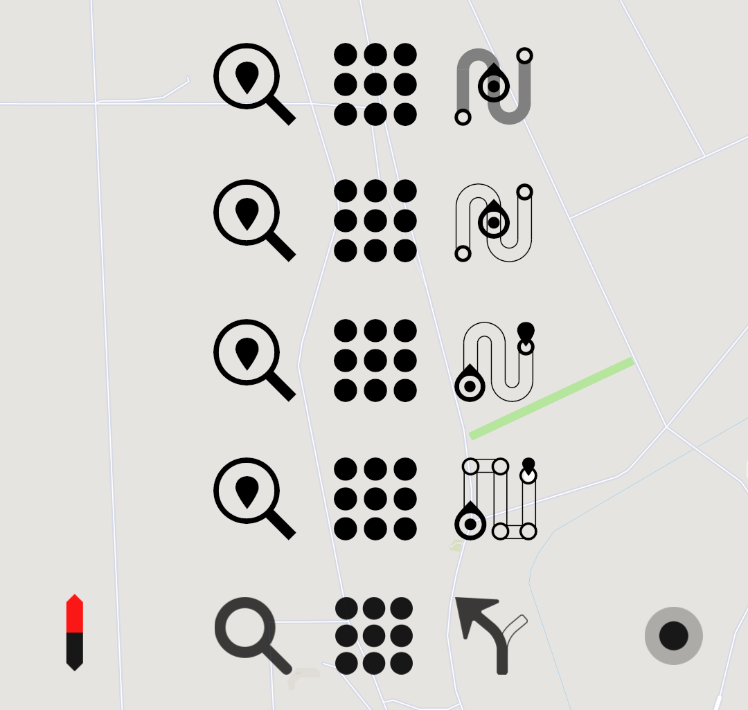
- I vote for the second row except for the right icon. It's not clear for me meaning of that icon.
- I agree about design with @Fellfrosch
- I vote for the second row except for the right icon. It's not clear for me meaning of that icon.
| The Following 5 Users Say Thank You to XOleg For This Useful Post: | ||
|
|
2019-03-05
, 23:01
|
|
Posts: 1,414 |
Thanked: 7,547 times |
Joined on Aug 2016
@ Estonia
|
#456
|
Great to see this constructive discussion! I'll take a back seat and focus on bugs/code when I get back. As for menu icon, don't forget that we may have to adopt main menu to support better landscape mode (HW phone seems to raise a lot of interest). Don't know how about you, but these 9 dots seem to me Pure/Poor/Whogo Maps identity as well. Would be sad to let them go.
As for navigation icon, I think we did have a discussion regarding it as well. Although, not sure it was conclusive at that time. We also have a chance to test the icons on new users (Linux desktop) and ask if they make sense.
PS: Forgot to say - thank you everyone participating in this discussion and proposing new icons! Its great help (and the way it should be)!
| The Following 6 Users Say Thank You to rinigus For This Useful Post: | ||
 |
|
2019-03-06
, 04:15
|
|
Posts: 363 |
Thanked: 1,377 times |
Joined on Nov 2015
@ Sweden
|
#457
|
Just a small note... there seem to be some confusion about list view/grid view icons.
To me, the cleanest icons is the ones below.
List view

Grid view

To me, the cleanest icons is the ones below.
List view
Grid view
| The Following 7 Users Say Thank You to eson For This Useful Post: | ||
|
|
2019-03-06
, 07:26
|
|
Posts: 1,092 |
Thanked: 4,997 times |
Joined on Dec 2009
@ beautiful cave
|
#458
|
Originally Posted by mosen
I can live with that one.
That is the great thing about collaboration.
Right, also the first bounding circle is fixed in sailfish icons (like for example in the clock icon). What about like so?
svg attached so you can pick up maybe on the gradient.
Back to the in app icons:
I agree with @eson. If we want to pronounce, that it is a list view, we should use just three horizontal lines. These are also a very common icon for "menu". On the other hand, what speaks against being a little bit unique in using the 9 dots instead. I for my self don't care if there opens a list or a grid view. And new users will get used to it quickly.
The search icon with the marker inside reminds me more on some station signs than a magnifier. I don't know if it's because of the thin lines or the marker inside. The original icon works better for me.
For the navigation icon im undecided. There are so many possibilities, but it seems anybody see the icon different. Speaking for myself I would go for the marker like @mosen suggested.
|
|
2019-03-06
, 07:52
|
|
Community Council |
Posts: 1,669 |
Thanked: 10,227 times |
Joined on Nov 2014
@ Lower Rhine
|
#459
|
Originally Posted by eson
@rinigus & eson
Just a small note... there seem to be some confusion about list view/grid view icons.
Yes, the doted grid view still looks better as i noted some posts ago.
No reason still to not try and make it technically correct imo.
One reason to change it would be its weight. The search and route icon tend to look super thin next to it.
Now if those icons are designed in same weight they would look awkward in the menu where we have thin icons like favourites, share and settings.
@eson, no confusion... Just scroll down the page you linked and you will see that the list-view page has more icons of the kind i proposed than the burger menu. Burger menu icons are ment for text menus.
We have a menu with icons in front of the text.
I know you are using pure maps longer than me and the grid-icon being part of the CI is a valid and strong point.
Now step in my shoes, doing webpages since '97 and instantly thinking about the wrong representation of the menu every time i click the grid button and get a list menu.
")
Yeah, sure i can live with that, but fellfrosch explained the no "Kraut und Rüben" rule.
Translates to something that has grown without control and guidelines like carrots and turnip.
It is not about finding a new search or route icon.
If we want to do it right, a whole new icon set should evolve over time.
Or the single icons in question need to be designed to fit the existing ones. As you can see, i am not capable of doing that on spot.
All i can is give ideas and hope for comments to move into a certain direction. Yes it is painfully slow and with a good designer you would not even see all the steps in between. Sorry for the confusion this might cause.
__________________
Watch our weird watchfaces for mighty AsteroidOS
Performance comparison Video Sailfish 2.0 vs 1.1.9 vs 1.1.7
[MC eV] Maemo Community eV membership application please concider to join!
Watch our weird watchfaces for mighty AsteroidOS
Performance comparison Video Sailfish 2.0 vs 1.1.9 vs 1.1.7
[MC eV] Maemo Community eV membership application please concider to join!
|
|
2019-03-06
, 09:15
|
|
Posts: 127 |
Thanked: 313 times |
Joined on Sep 2016
@ Yekaterinbourg, Russia
|
#460
|
@mosen, Yes! I vote for second row from top as Nav icon or fourth row from top but without black marker(end point).
Speaks for you that you are able to let go of something you put effort into. Kudos!
The one you linked now is a sailfish logo with puremaps marker elements. I know the difference is marginal but look at how beautifull the actual marker looks if it is simply blown up and angled 45 degree
First picture shows the difference of the marker to a sailfish logo. It has an actual tip and a more curved and slightly slimmer body.
Also mind the perfectly balanced spacing and thickness of the rings. The dot in center has the same radius as the thickness of the white and blue element.
In the second we have the original color.
Sure all sailfish icons have a gradient on them. But as we are resembling our direction marker i think we should leave it flat.
Not saying it is not worth to try more and look further. Maybe a gradiant actually does look cool. So svg attached to advance from there.
@rinigus, understood regarding map layer icon. I did not know you where planning to put it on the actual map page. Lets see if i can come up with something until friday.
Watch our weird watchfaces for mighty AsteroidOS
Performance comparison Video Sailfish 2.0 vs 1.1.9 vs 1.1.7
[MC eV] Maemo Community eV membership application please concider to join!
Last edited by mosen; 2019-03-05 at 11:31.