 |
|
2015-01-19
, 16:15
|
|
Posts: 764 |
Thanked: 2,889 times |
Joined on Jun 2014
|
#21
|
I see. Well, I wouldn't like if the OS made that kind of stuff mandatory. The best applications aren't necessarily the ones that adhere most to the guidelines. Of course, usually if an application doesn't follow guidelines it looks/functions awful(ly).
| The Following User Says Thank You to nthn For This Useful Post: | ||
|
|
2015-01-19
, 19:55
|
|
Posts: 229 |
Thanked: 725 times |
Joined on Sep 2010
@ Permanent cruiser - either water- or motorways
|
#22
|
Originally Posted by nthn

Not a mobile one but that doesn't make it any better ;-) the chance of a new OS is to do such things better (or at least less worse) than the competitors ... - people are only willing to learn new things if there is a profit or if it makes things easier or less annoying ... 
Honestly, that doesn't really have anything to do with consistency in the UI, and everything to do with consistency between developers (and not following guidelines). Of course this is different in any app. Do you have an example of an OS where every application has the same menu options in the same place every time?
I had no problem because I'm a try-and-error-user anyway but I thing that Jolla want to sell devices not only to the few people who always want something different ;-)
|
|
2015-01-19
, 20:17
|
|
|
Posts: 6,453 |
Thanked: 20,983 times |
Joined on Sep 2012
@ UK
|
#24
|
The way eagis suggested? By enforcing it at the OS level.
I don't know how Apple does it but one way Sail could enforce at least menu consistency is by having a fixed structure where the app developer would only tick a box "yes, I want this one" and "no, I don't want that one". That way, the order would be always consistent.
I don't know how Apple does it but one way Sail could enforce at least menu consistency is by having a fixed structure where the app developer would only tick a box "yes, I want this one" and "no, I don't want that one". That way, the order would be always consistent.
__________________
Русский военный корабль, иди нахуй!
Русский военный корабль, иди нахуй!
|
|
2015-01-19
, 20:24
|
|
|
Posts: 1,986 |
Thanked: 7,698 times |
Joined on Dec 2010
@ Dayton, Ohio
|
#25
|
Yeah, I gotta agree, Apple has always managed to do the best at maintaining a logical and consistent UI among their computing devices. (Even if I do disagree with their choices from time to time...)
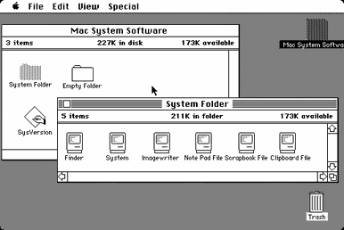
A small nitpick here: if you go back to the _very_ beginning of time (as far back as 1984 in this case), it was Apple menu, File, Edit, View, app specific menus:

Still, a remarkably consistent GUI for over 30 years now...
Since the beginning of time, it's always been Apple menu, App menu, File, Edit, View, app specific menus, Help.

Still, a remarkably consistent GUI for over 30 years now...

| The Following 6 Users Say Thank You to Copernicus For This Useful Post: | ||
|
|
2015-01-23
, 07:16
|
|
Posts: 2,225 |
Thanked: 3,822 times |
Joined on Jun 2010
@ Florida
|
#26
|
Originally Posted by elastic

I am aware that it's in the ballpark of what I'm talking about, at least on the surface. But, for example, when I press the Text Messages app icon on my BB Z10, it takes me to the Hub - is there any way that I as a user can have my SMS/MMS messages accessed through another dedicated app on the device? Can I at the same time make them /not/ appear in the Hub at all?
And that is exactly what the BB10 hub does... the user decides what he/she wants to see in the hub ...
What I meant is an even deeper freedom, as well as good software compartmentalization/decoupling, than what the BB10 Hub seems to have - but I do certainly recognize that the Hub's configurability takes it more in the right direction.
__________________
If you want to donate in support of anything that I do, you can do so with either of these options:
PayPal | Bitcoin: 1J4XG2z97iFEKNZXThHdFHq6AeyWEHs8BJ | [Will add other donation options eventually]
If you want to donate in support of anything that I do, you can do so with either of these options:
PayPal | Bitcoin: 1J4XG2z97iFEKNZXThHdFHq6AeyWEHs8BJ | [Will add other donation options eventually]
| The Following User Says Thank You to Mentalist Traceur For This Useful Post: | ||
|
|
2015-01-24
, 06:36
|
|
|
Posts: 27 |
Thanked: 36 times |
Joined on Aug 2008
|
#27
|
Originally Posted by pichlo

nope. If you e.g. delete a picture and close the gallery while the remorse timer is running, the picture is gone... and it's the same for mails, notifications, etc. Just go on with the next thing you want to do and ignore the remorse timer. But ignoring is the hard part here. Countdowns make you stare at it till the end :-)

Oh yes! I absolutely LOVE the remorse timer and I hope it to make its way to the desktop world one day. Although it also has its weekness: you can't speed it up. Delete-are you sure-yes can be done under a second, remorse has to run out (and you can't just close the application as that counts as stop).
|
|
2015-01-24
, 07:16
|
|
|
Posts: 6,453 |
Thanked: 20,983 times |
Joined on Sep 2012
@ UK
|
#28
|
Originally Posted by shining235

People also used to believe that heavy objects fell faster than the light ones. It just made sense. Until someone dared to challenge that with an experiment.
If you e.g. delete a picture and close the gallery while the remorse timer is running, the picture is gone... and it's the same for mails, notifications, etc.
I have just tried File Browser, Email and Gallery. Gallery was the only one that deleted the picture when I closed the application while the timer was running.
Consistency? What's that?

__________________
Русский военный корабль, иди нахуй!
Русский военный корабль, иди нахуй!
Last edited by pichlo; 2015-01-24 at 12:25. Reason: spellung
| The Following 5 Users Say Thank You to pichlo For This Useful Post: | ||


