|
|
2009-05-19
, 13:36
|
|
|
Posts: 1,656 |
Thanked: 1,196 times |
Joined on Apr 2008
@ Alabama, USA
|
#32
|
Originally Posted by EIPI

Its already been addressed and will be done, also guess I'm going to give in and make this theme fit cells phones a little better. that should also make it work on tablets rotated.

Thanks Andrew for all the work on these minimalist themes. Would it be possible to put the Quote|Quick Reply|Thanks and the signatures within the white space that contains the post? I am finding it a little confusing to separate posts on the screen. In the talk.maemo.org layout, the quote and signatures are within the white space, making each post looks like an island.
__________________
Home Page - Preenv Wiki
**All Posts are made as a Community Member and not as a Super Moderator of this site.
Home Page - Preenv Wiki
**All Posts are made as a Community Member and not as a Super Moderator of this site.
|
|
2009-05-20
, 13:36
|
|
|
Posts: 2,853 |
Thanked: 968 times |
Joined on Nov 2005
|
#33
|
Minimalist 2 already runs fine on (big) phones, I'm typing this on an E71 :-)
|
|
2009-05-20
, 17:48
|
|
|
Posts: 1,656 |
Thanked: 1,196 times |
Joined on Apr 2008
@ Alabama, USA
|
#34
|
Originally Posted by fpp

I was told it forces you to scroll left to right. 
Minimalist 2 already runs fine on (big) phones, I'm typing this on an E71 :-)
Here are the changes I have done to the theme since the last update, if no one has anymore then I will have Reggie update the live site again. I'll put some screen shots up later, my n810 is in the car right now.
Home/menu
- rename Home link to Talk
- shorted main menu
- add lines around categories
user CP
- move links to User CP
- turn menu into vertical list
- removed user cp menu from private messages pages.
Post Bit
- Add | between Quick reply and thanks!
- remove IM Icons
- shorted thanks info
- put everything in white background
- remove search form
Dark variant
- Fix pop up on dark theme.
- lighten background on dark theme
- drop white borders
__________________
Home Page - Preenv Wiki
**All Posts are made as a Community Member and not as a Super Moderator of this site.
Home Page - Preenv Wiki
**All Posts are made as a Community Member and not as a Super Moderator of this site.
|
|
2009-05-21
, 13:43
|
|
|
Posts: 1,656 |
Thanked: 1,196 times |
Joined on Apr 2008
@ Alabama, USA
|
#35
|
New screenshots I'll give everyone time to comment before I update site. These screenshots are at 480 x 800 to show the site rotated or on a large screen phone. Please comment on lighter Dark Version colors.
Light Version:
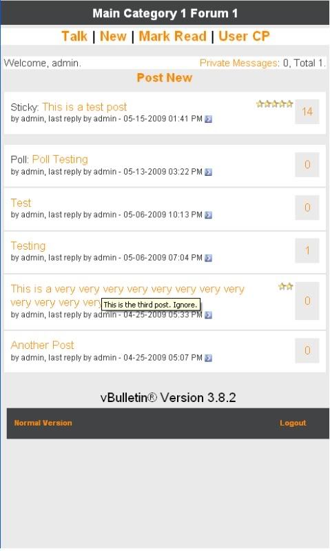
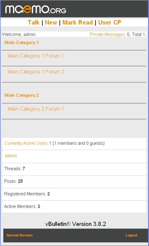
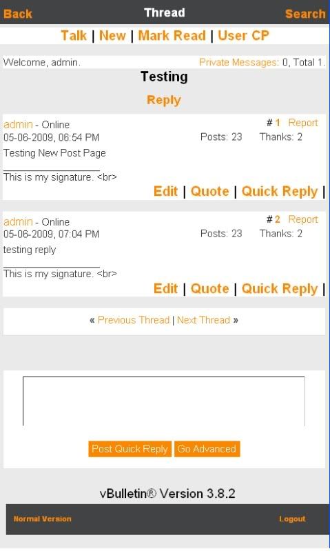
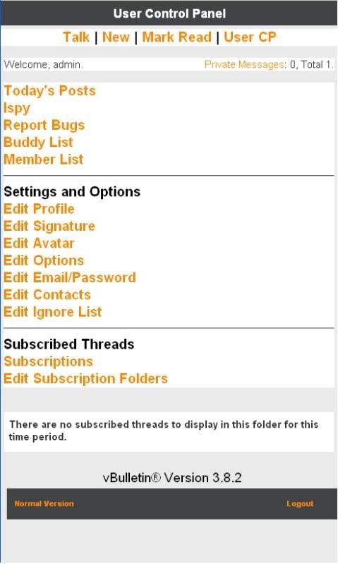
Dark Version:
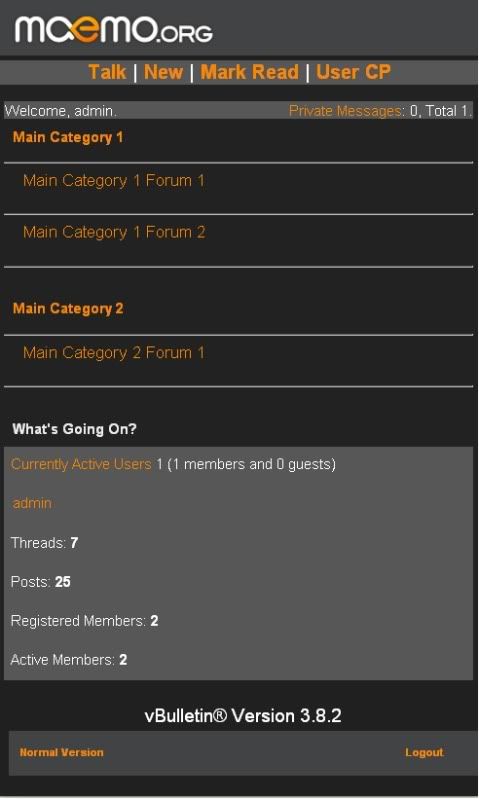
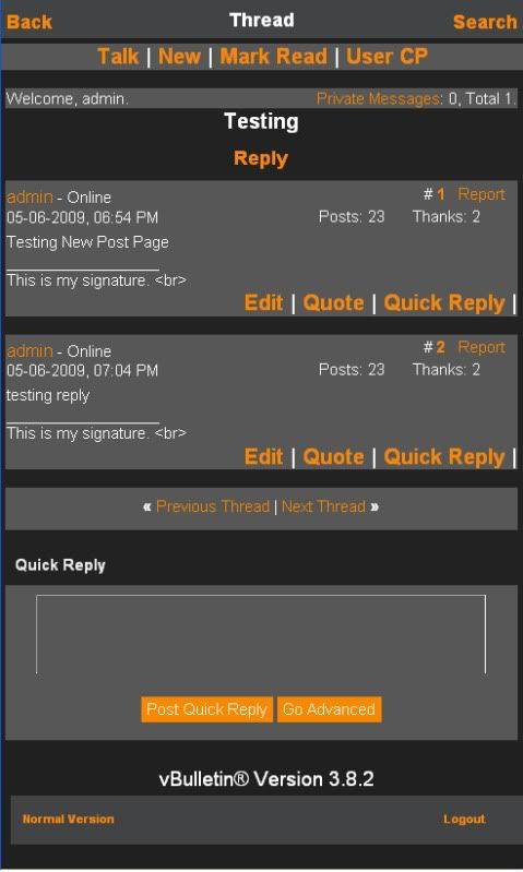
Light Version:


Dark Version:


__________________
Home Page - Preenv Wiki
**All Posts are made as a Community Member and not as a Super Moderator of this site.
Home Page - Preenv Wiki
**All Posts are made as a Community Member and not as a Super Moderator of this site.
|
|
2009-05-21
, 14:00
|
|
|
Posts: 3,105 |
Thanked: 11,088 times |
Joined on Jul 2007
@ Mountain View (CA, USA)
|
#36
|
Looks good!
Are you sure about keeping the big fonts in "Edit | Quote..." The font used in the default theme is good already.
A small detail I really like about the Minimalistic that should be adopted b the default theme is the bigger clickable area around the number of posts in the "New" & "Today" listings. Super finger-friendly. In the default theme the number is also big but the clickable area covers the number and nothing else. The extra surface in Minimalistic makes it much more usable e.g. when sticking the finger to pop up the 'Open in new page' dialog.
|
|
2009-05-21
, 14:58
|
|
|
Posts: 1,656 |
Thanked: 1,196 times |
Joined on Apr 2008
@ Alabama, USA
|
#38
|
Originally Posted by qgil

to please you and fms I lowered the font size on those and main menu.

Looks good!
Are you sure about keeping the big fonts in "Edit | Quote..." The font used in the default theme is good already.
A small detail I really like about the Minimalistic that should be adopted b the default theme is the bigger clickable area around the number of posts in the "New" & "Today" listings. Super finger-friendly. In the default theme the number is also big but the clickable area covers the number and nothing else. The extra surface in Minimalistic makes it much more usable e.g. when sticking the finger to pop up the 'Open in new page' dialog.
__________________
Home Page - Preenv Wiki
**All Posts are made as a Community Member and not as a Super Moderator of this site.
Home Page - Preenv Wiki
**All Posts are made as a Community Member and not as a Super Moderator of this site.
| The Following User Says Thank You to andrewfblack For This Useful Post: | ||
|
|
2009-05-21
, 15:07
|
|
|
Posts: 1,436 |
Thanked: 3,144 times |
Joined on Jul 2005
|
#39
|
Some more quick-fix suggestions:
- change fonts of 'Online', post date, 'Posts: n', 'Thanks: n', and vBulletin version to a smaller font
- right justify 'Posts: n' and 'Thanks: n'.
- do not display signatures at all
- change font size of category names to same size of 'Edit, Quote, Quick Reply'.
- add maemo.org logo on all pages
__________________
Reggie Suplido
Reggie Suplido
|
|
2009-05-21
, 15:14
|
|
|
Posts: 1,656 |
Thanked: 1,196 times |
Joined on Apr 2008
@ Alabama, USA
|
#40
|
Reggie look on sandbox I lowered Edit, Quote, Reply size due to a few people asking you want the category names to be that new size or do you prefer the larger size for both? Also do you want to keep category names and search link in top bar with maemo.org logo or drop everything but the logo.
__________________
Home Page - Preenv Wiki
**All Posts are made as a Community Member and not as a Super Moderator of this site.
Home Page - Preenv Wiki
**All Posts are made as a Community Member and not as a Super Moderator of this site.


Last edited by EIPI; 2009-05-19 at 11:43. Reason: clarify