


Active Topics
-
[HOWTO] Comprehensive Firmware Flashing Guide for N9 (1,580)
to Nokia N9 / N950 by aspergerguy - 1 day, 6 hrs ago -
Nokia N9-00 Prototype Build S1.12 (RM-680 codename "Dali") (250)
to Nokia N9 / N950 by en0s - 4 days, 2 hrs ago -
[Announce] Maebble - Pebble support for Maemo (118)
to Applications by glo-worm - 4 days, 15 hrs ago -
Possible to flash Leste to eMMC? (6)
to Maemo 7 / Leste by Eri - 5 days, 5 hrs ago - more...

| The Following 4 Users Say Thank You to rinigus For This Useful Post: | ||
 |

|
2019-03-06
, 12:13
|
|
Community Council |
Posts: 1,669 |
Thanked: 10,226 times |
Joined on Nov 2014
@ Lower Rhine
|
#462
|
Originally Posted by rinigus

Yep, lets try that way.
Which brings me to the question: should we start putting some kind of background circle under them (from program side)? And if we should, should we put it under compass (have seen that earlier) and scale (not seen that done).
It is very hard to design thin icons that are recognizable on a chaotic map.
Having a reliable level of contrast below the icons would help. In the menu they are displayed on high contrast. Using the same icons on a map is much easier with a background imo.
The compass could definitely profit from a circle so it is more in line with the center-view dot design.
The scale in its current form however makes much sense to display without background because it helps to grasp the dimension/scale better when the map is visible beneath it imo.
__________________
Watch our weird watchfaces for mighty AsteroidOS
Performance comparison Video Sailfish 2.0 vs 1.1.9 vs 1.1.7
[MC eV] Maemo Community eV membership application please concider to join!
Watch our weird watchfaces for mighty AsteroidOS
Performance comparison Video Sailfish 2.0 vs 1.1.9 vs 1.1.7
[MC eV] Maemo Community eV membership application please concider to join!
Last edited by mosen; 2019-03-06 at 15:28.
| The Following 4 Users Say Thank You to mosen For This Useful Post: | ||
|
|
2019-03-06
, 15:28
|
|
Community Council |
Posts: 1,669 |
Thanked: 10,226 times |
Joined on Nov 2014
@ Lower Rhine
|
#463
|
design unrelated.
What is the reasoning for having a dedicated menu row for the "center-view" button/feature that is already available in the map view?
What do people use it for from within the menu?
If i want to center on my position i am in 100% cases viewing the map.
The reason to have the "keep view centered" toggle in menu bottom rows is clear to me. One wants to know if it is active while looking at the menu and having all toggles in one place is also nice.
Although i tried to longpress the center-view button on the map when i first tried to toggle keep-center-view.
Would longpress make sense to integrate?
The advantage would be on step fewer to toggle keep-view-centered, removing the necessity to enter the menu.
__________________
Watch our weird watchfaces for mighty AsteroidOS
Performance comparison Video Sailfish 2.0 vs 1.1.9 vs 1.1.7
[MC eV] Maemo Community eV membership application please concider to join!
Watch our weird watchfaces for mighty AsteroidOS
Performance comparison Video Sailfish 2.0 vs 1.1.9 vs 1.1.7
[MC eV] Maemo Community eV membership application please concider to join!
| The Following 4 Users Say Thank You to mosen For This Useful Post: | ||
|
|
2019-03-06
, 22:50
|
|
Community Council |
Posts: 1,669 |
Thanked: 10,226 times |
Joined on Nov 2014
@ Lower Rhine
|
#464
|
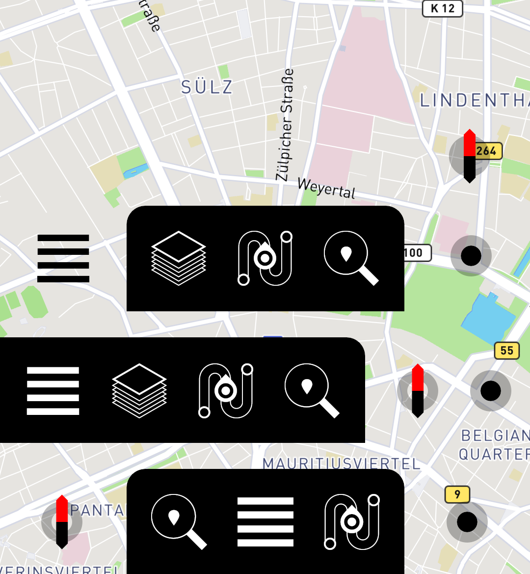
Using the background we already have from the navigation landscape items gives a whole new level of consistency imho.
Shifted the menu around a bit also + new map-layer icon that reflects the sheer amount of maps we got.
Last edited by mosen; 2019-03-06 at 23:01.
Shifted the menu around a bit also + new map-layer icon that reflects the sheer amount of maps we got.
__________________
Watch our weird watchfaces for mighty AsteroidOS
Performance comparison Video Sailfish 2.0 vs 1.1.9 vs 1.1.7
[MC eV] Maemo Community eV membership application please concider to join!
Watch our weird watchfaces for mighty AsteroidOS
Performance comparison Video Sailfish 2.0 vs 1.1.9 vs 1.1.7
[MC eV] Maemo Community eV membership application please concider to join!
Last edited by mosen; 2019-03-06 at 23:01.
| The Following 6 Users Say Thank You to mosen For This Useful Post: | ||
|
|
2019-03-07
, 05:23
|
|
Posts: 127 |
Thanked: 313 times |
Joined on Sep 2016
@ Yekaterinbourg, Russia
|
#465
|
@mosen. I like bottom row. But maybe it's better without enormous black background for smartphone?
| The Following 6 Users Say Thank You to XOleg For This Useful Post: | ||
 |
|
2019-03-07
, 06:31
|
|
Posts: 1,092 |
Thanked: 4,997 times |
Joined on Dec 2009
@ beautiful cave
|
#466
|
Originally Posted by mosen
Using a bold black background we are losing infos, which we could have seen if there is a transparent background.
Using the background we already have from the navigation landscape items gives a whole new level of consistency imho.
Shifted the menu around a bit also + new map-layer icon that reflects the sheer amount of maps we got.
https://mosushi.de/misc/puremaps/overview4.png
I already criticized the search icon with the marker inside. On the black background it works even worse for me. The search icon for me looks no more like a pan with one single fried egg in.
Alll in all I'm not so sure if we really need a complete new icon set. I looked at the in app icons and they looked to me quite consistent. Only the Center Map Icon in the menu looks somewhat unfitting. But
as you already pointed out we don't really need that in the menu, it is enough to have it in map view.
| The Following 4 Users Say Thank You to Fellfrosch For This Useful Post: | ||
|
|
2019-03-07
, 07:44
|
|
Posts: 1,092 |
Thanked: 4,997 times |
Joined on Dec 2009
@ beautiful cave
|
#467
|
One further question, I don't know how it works from the technical side. If I remember correctly, rinigus told once, that the icons are automatically generated from the SVGs to match the resolution of the device. If so all should be fine, if not, the really thin lines of the last suggested icons could be a problem on different screens.
 |
|
2019-03-07
, 09:09
|
|
Posts: 764 |
Thanked: 2,889 times |
Joined on Jun 2014
|
#468
|
Now that we're talking about icons, I've just noticed that the current launcher icon for Pure Maps still has a very light background layer with square corners. You'll see it if you put Pure Maps in a folder and use a light theme.
| The Following 4 Users Say Thank You to nthn For This Useful Post: | ||
|
|
2019-03-07
, 09:27
|
|
Posts: 1,092 |
Thanked: 4,997 times |
Joined on Dec 2009
@ beautiful cave
|
#469
|
That shouldn't be. Here you can see it on a white background, there is nothing to see: https://openrepos.net/content/rinigus/pure-maps
I also tested it on my phone.
Do you have a screenshot?
We talked anyway about replacing it. So probably there is no further action needed.
Last edited by Fellfrosch; 2019-03-07 at 09:38.
I also tested it on my phone.
Do you have a screenshot?
We talked anyway about replacing it. So probably there is no further action needed.
Last edited by Fellfrosch; 2019-03-07 at 09:38.
|
|
2019-03-07
, 09:39
|
|
Posts: 764 |
Thanked: 2,889 times |
Joined on Jun 2014
|
#470
|
Originally Posted by Fellfrosch
Haha, thanks for making me double check. Turns out the square corners I was talking about aren't part of the Pure Maps icon, but of a square icon in the launcher that's slightly visible through the white background of the folder.
That shouldn't be. Here you can see it on a white background, there is nothing to see: https://openrepos.net/content/rinigus/pure-maps
Do you have a screenshot?
We talked anyway about replacing it. So probably there is no further action needed.
Edit: just for reference, the patch you're using alters the look of the folder. The normal look adds another layer of slightly transparent white (or black if you're using a dark theme) on top of the launcher.
| The Following 5 Users Say Thank You to nthn For This Useful Post: | ||
On SFOS, we do have hamburger menu icon as well - thinner and going for double burger (4 lines). Maybe that should be used instead?
As to whether thin icons should be used - have you tried to put a map under it? Which brings me to the question: should we start putting some kind of background circle under them (from program side)? And if we should, should we put it under compass (have seen that earlier) and scale (not seen that done).