


Active Topics
-
[HOWTO] Comprehensive Firmware Flashing Guide for N9 (1,580)
to Nokia N9 / N950 by aspergerguy - 1 day, 3 hrs ago -
Nokia N9-00 Prototype Build S1.12 (RM-680 codename "Dali") (250)
to Nokia N9 / N950 by en0s - 3 days, 23 hrs ago -
[Announce] Maebble - Pebble support for Maemo (118)
to Applications by glo-worm - 4 days, 11 hrs ago -
Possible to flash Leste to eMMC? (6)
to Maemo 7 / Leste by Eri - 5 days, 2 hrs ago - more...

 rinigus
 |
2019-03-08
, 21:27
|
|
Posts: 1,414 |
Thanked: 7,547 times |
Joined on Aug 2016
@ Estonia
|
#481
|
Originally Posted by Fellfrosch

We have a very kind permission for @otsaloma to use the icon. I will start looking into few bugs and then get to buttons/icons.
| The Following 7 Users Say Thank You to rinigus For This Useful Post: | ||
|
|
2019-03-10
, 14:50
|
|
Posts: 1,414 |
Thanked: 7,547 times |
Joined on Aug 2016
@ Estonia
|
#482
|
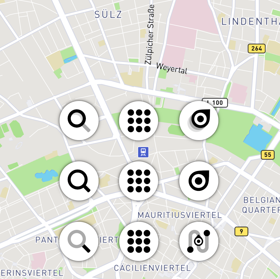
I have added buttons with only route icon used at present, matter of further discussion on which icons to finalize on.
Below, are screenshots from SFOS (day & night) and with Kirigami. In general, it looks like a way to go and since we have a mode where we can hide all the buttons that are not needed, it works quite well in practice. At least, that's my impression after using it for a bit.
Few observations:
* compass and current position buttons cannot fit comfortably on the bottom, unless in landscape. hence, moved up right. its in the same order as used in navigation and would have to have the same order to work well.
* button background is not defined by theme, but by the map style. This is in contrast with the panels (navigation and info) which are defined by the theme/ambience of the phone. I intend to keep it that way since panels have larger areas, in general. I hope its not confusing.
* routing icon could be too thin for this purpose, but the designers among us will tell us better. notice that the extreme case of scaling is on Kirigami menu bar. Probably, separate icons are needed for such small scale.
Pure Maps icon has been changed, cover image stayed as it was. Now with the data from the screenshots, I hope it will be easier to looks through possible designs.
PS: changes are currently implemented in one of the branches at github
| The Following 12 Users Say Thank You to rinigus For This Useful Post: | ||
Amboss, carlosgonz, Fellfrosch, Halftux, imaginaryenemy, juiceme, lal, mosen, nthn, olf, PamNor, peterleinchen | ||
 |
|
2019-03-10
, 16:18
|
|
Community Council |
Posts: 1,669 |
Thanked: 10,226 times |
Joined on Nov 2014
@ Lower Rhine
|
#483
|
Originally Posted by rinigus
Now that you decided on a background, i will check if any of my drafts can be made to fit the design of the search and menu icon. Most difficult is the weight...
* routing icon could be too thin for this purpose
It is super hard to draw any kind of detail with those thick lines. (explaining most of the excursion in my last ten or so posts)
Happy to have a direction now.
How did you define the measures?
If i measure in gimp i get ~150px for the circles and 90px for the contained icon at 1920x1080, correct?
__________________
Watch our weird watchfaces for mighty AsteroidOS
Performance comparison Video Sailfish 2.0 vs 1.1.9 vs 1.1.7
[MC eV] Maemo Community eV membership application please concider to join!
Watch our weird watchfaces for mighty AsteroidOS
Performance comparison Video Sailfish 2.0 vs 1.1.9 vs 1.1.7
[MC eV] Maemo Community eV membership application please concider to join!
| The Following 6 Users Say Thank You to mosen For This Useful Post: | ||
|
|
2019-03-10
, 17:46
|
|
Posts: 1,414 |
Thanked: 7,547 times |
Joined on Aug 2016
@ Estonia
|
#484
|
Originally Posted by mosen
Dimensions should depend on device (PPI) and defined theme sizes (SFOS, Kirigami, Qt).
Now that you decided on a background, i will check if any of my drafts can be made to fit the design of the search and menu icon. Most difficult is the weight...
It is super hard to draw any kind of detail with those thick lines. (explaining most of the excursion in my last ten or so posts)
Happy to have a direction now.
How did you define the measures?
If i measure in gimp i get ~150px for the circles and 90px for the contained icon at 1920x1080, correct?
In this particular case, 9 dots icon is ~88 pixels and circle is 149 (circle diameter is icon width*sqrt(2)*1.2, icons are assumed as a square or max(width,height) is taken).
In general, icons are smaller than before. With circles, similar size is achieved and there is invisible space around to give you bit of a wiggle when you press them.
Not sure how much details we want/need on such scale. If you have android phone or ios, check out Google Maps / Apple Maps / HERE (or check out online screenshots). I presume we need similar kind of details taking into account the size.
Note that with routing icon, we would also need a version for "Navigate To" and "Navigate From". On Kirigami, the following icons were used until "the real ones" will appear: https://github.com/rinigus/pure-maps...m-symbolic.svg https://github.com/rinigus/pure-maps...o-symbolic.svg
| The Following 5 Users Say Thank You to rinigus For This Useful Post: | ||
|
|
2019-03-10
, 18:16
|
|
Posts: 1,414 |
Thanked: 7,547 times |
Joined on Aug 2016
@ Estonia
|
#485
|
PS: We start with route/search, but there is also "Nearby" which seems to be really tricky
| The Following 5 Users Say Thank You to rinigus For This Useful Post: | ||
|
|
2019-03-10
, 23:04
|
|
Community Council |
Posts: 1,669 |
Thanked: 10,226 times |
Joined on Nov 2014
@ Lower Rhine
|
#486
|
Quick drafts
Row1, has 2 transparency stages, 30% and 60% in both search and route. Both icons circles are same size and line thickness.
The 9grid balls are made a tiny bit smaller so they fit 8px in the 64 pix grid of the svg file definition and are same size as the routemarker centerdot.
Row2, tried to max out the size within the circles while keeping weight ratio between search and route.
Menu icon also with adjusted 8px grid ball thickness, compare to row 3 which has the old menu icon with ~8.2px wide circles.
Row3, extending from the route icon rinigus choose currently. Route icon with 60% filled road and end dots in same size as menu grid dots. search icon with 60% transparent frame and same line thickness as the road in route icon.
Ah, and did you notice the route icon resembles an N for navigation? Forgot to mention last time.
__________________
Watch our weird watchfaces for mighty AsteroidOS
Performance comparison Video Sailfish 2.0 vs 1.1.9 vs 1.1.7
[MC eV] Maemo Community eV membership application please concider to join!
Watch our weird watchfaces for mighty AsteroidOS
Performance comparison Video Sailfish 2.0 vs 1.1.9 vs 1.1.7
[MC eV] Maemo Community eV membership application please concider to join!
| The Following 7 Users Say Thank You to mosen For This Useful Post: | ||
|
|
2019-03-11
, 06:24
|
|
Posts: 1,414 |
Thanked: 7,547 times |
Joined on Aug 2016
@ Estonia
|
#488
|
@mosen, thank you! I started testing with Row #1. What attracts to it is the simple modification of route icon allowing us to make "navigate to" and "navigate from" easily by adding either destination or origin dot on tip of the arrow or the base of moving icon, respectively.
@XOleg: current icon is used as a cover for Pure Maps. Discussion regarding it was few pages back and it sounded like the simpler version was preferred.
@XOleg: current icon is used as a cover for Pure Maps. Discussion regarding it was few pages back and it sounded like the simpler version was preferred.
| The Following 4 Users Say Thank You to rinigus For This Useful Post: | ||
 |
|
2019-03-11
, 08:31
|
|
Posts: 1,092 |
Thanked: 4,997 times |
Joined on Dec 2009
@ beautiful cave
|
#489
|
@mosen thanx for your new icon drawings. And thanx for correcting the search icon and leaving the marker aside!
Your new proposals are all more of my taste again. Anyway I have some smaller points:
First row is quite nice, but could you try to move the Navigation Icon a little bit to the left bottom, so it looks optical a bit more centred
Second row: Straight an clear. My favourite, even so I like the combination of black and grey from the other rows.
Third row: Again the navigation Icon: You made similar suggestions before and there was always something what I found irritating. But it took me a while to find out what: If you follow the marker you are driving to the starting point. At least for somebody of the western culture, because here people are used to read from left to right. That's just a small issue and shouldn't be a showstopper (also I have no idea for a solution), anyway wanted to point it out.
Also I think the marker should be a little bit bigger. looking at that icon in a smaller size, makes it hard to recognize, what it is.
So for me first and second row are nearly on the same stage. With the last row i still have some problems with the navigation icon, but just small ones, so I wouldn't mind if we decide to choose this row.
| The Following 5 Users Say Thank You to Fellfrosch For This Useful Post: | ||
|
|
2019-03-11
, 08:36
|
|
Posts: 1,092 |
Thanked: 4,997 times |
Joined on Dec 2009
@ beautiful cave
|
#490
|
Originally Posted by rinigus
I think for the compass icon, It would be nice, if we use one of mosen's suggestions here:
Below, are screenshots from SFOS (day & night) and with Kirigami. In general, it looks like a way to go and since we have a mode where we can hide all the buttons that are not needed, it works quite well in practice. At least, that's my impression after using it for a bit.
http://talk.maemo.org/showpost.php?p...&postcount=472
It would fit better to the center icon.
| The Following 5 Users Say Thank You to Fellfrosch For This Useful Post: | ||