| The Following 21 Users Say Thank You to franchg For This Useful Post: | ||
|
|
2010-04-13
, 17:03
|
|
Posts: 9 |
Thanked: 1 time |
Joined on Feb 2010
|
#2
|
Not bad, but not much of eyecandy yet; but hopefully should get better when it comes out for consumers.
|
|
2010-04-13
, 17:06
|
|
|
Posts: 844 |
Thanked: 521 times |
Joined on Jan 2009
@ UK southampton
|
#3
|
Looks nice.
2 things I noticed
Potrait mode as standard
No hardware keyboard.
Hope they manage to sort Fennec out before release could bite them in the bum if it not even upto MicroB standard on release.
2 things I noticed
Potrait mode as standard
No hardware keyboard.
Hope they manage to sort Fennec out before release could bite them in the bum if it not even upto MicroB standard on release.
|
|
2010-04-13
, 17:14
|
|
Posts: 244 |
Thanked: 155 times |
Joined on Aug 2009
@ DC
|
#4
|
I prefer this color scheme/font to Maemo's.
It looks good visually and is finally comparable to other OS's on the market. What even better is all the feature and functionality that will be supported.
It looks good visually and is finally comparable to other OS's on the market. What even better is all the feature and functionality that will be supported.
|
|
2010-04-13
, 17:14
|
|
|
Posts: 741 |
Thanked: 900 times |
Joined on Nov 2007
@ Auckland NZ
|
#5
|
I like it but I hope Nokia doesn't leak too much UI info about their upcoming phones months before it's released. I would prefer to have my mind blown on launch day.
|
|
2010-04-13
, 17:18
|
|
|
Posts: 1,839 |
Thanked: 2,432 times |
Joined on May 2009
|
#6
|
Originally Posted by maluka

Funny that you ask that 
I like it but I hope Nokia doesn't leak too much UI info about their upcoming phones months before it's released. I would prefer to have my mind blown on launch day.
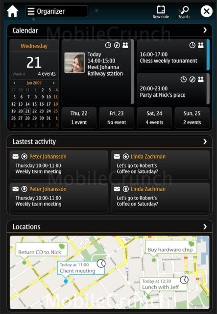
 Here's one pic that i didn't think too much about 7-8 months ago when they where leaked, but it looks exactly like the Qt4.6/harmattan demo we got to test with N900 some months ago.
Last edited by tissot; 2010-04-13 at 17:21.
|
|
2010-04-13
, 17:19
|
|
|
Posts: 762 |
Thanked: 395 times |
Joined on Jan 2010
@ Helsinki
|
#7
|
Looks pretty nice to me. Can't wait!
I hope they have tonnes of people working on MeeGo, making it a really finalised product with nothing having to be (too) rushed or "left for community development".
I hope they have tonnes of people working on MeeGo, making it a really finalised product with nothing having to be (too) rushed or "left for community development".

|
|
2010-04-13
, 17:19
|
|
|
Posts: 528 |
Thanked: 895 times |
Joined on Oct 2007
@ Moscow, Russia
|
#8
|
I'm seing non-wvga resolution (more n97 like) and lots of senseless info. I'm working on a short 2m video bout my vision of MeeGo UI. Some tiny part of it for example:

I hope to release it before major MeeGo announcement just to compare my work with whole maemo/meego design unit results.

I hope to release it before major MeeGo announcement just to compare my work with whole maemo/meego design unit results.
__________________
Maemo UI improvements blog.
Maemo UI improvements blog.
| The Following 6 Users Say Thank You to wazd For This Useful Post: | ||
|
|
2010-04-13
, 17:20
|
|
Posts: 1,746 |
Thanked: 2,100 times |
Joined on Sep 2009
|
#9
|
Originally Posted by tissot

Looks slick, but exceedingly busy. I don't think that would fly unless it was the result of an end-user going config-crazy 
Funny that you ask thatHere's one pic that i didn't think too much about 7-8 months ago when they where leaked, but it looks exactly like the Qt4.6/harmattan demo we got to test with N900 some months.

| The Following User Says Thank You to wmarone For This Useful Post: | ||
|
|
2010-04-13
, 17:23
|
|
Posts: 237 |
Thanked: 167 times |
Joined on Feb 2007
@ Powell, OH
|
#10
|
Don't forget this is MeeGo's default mobile UX, not necessarily Nokia's MeeGo UX. Each hardware manufacture can build their own UX just like Android. That's always Nokia's message about the N900 and MeeGo. Will MeeGo run on the N900 - yes. Will Nokia have an polished MeeGo UX for N900 - ?. At least we might have a nice looking base MeeGo UX based on the screen shots.


More about MeeGo at IDF here:
http://carrypad.com/2010/04/13/meego...loper-details/
Looks nice, imo!