| The Following User Says Thank You to daddeddad For This Useful Post: | ||
|
|
2010-11-26
, 16:29
|
|
Posts: 1,751 |
Thanked: 844 times |
Joined on Feb 2010
@ Sweden
|
#22
|
Originally Posted by daddeddad

Thanks.. will do so. Even though it is not finished it looks awesome. By the way... are your volume notification working? Mine doesn't show.. i was wondering if it was my doing or if it already where like this...

wmButtonRightHalf.png
wmLeftButtonEnd.png
wmRightButton.png
And I myself have been bugged by it.*I decreased the filling in a dumb way and the result is that the line is not a coherent 1px line but some 0.8px. The dropdown menus are made correctly. You might want to pay some intérest to wmEditModeButton* those are quite bad right now too.
__________________
You like what i do? Donate!
Make your desktop look awesome - use the AwOken Theme with the AwOken Icon Theme.
Add me on twitter @almehdin
Visit the swedish maemo/meego community forums
You like what i do? Donate!
Make your desktop look awesome - use the AwOken Theme with the AwOken Icon Theme.
Add me on twitter @almehdin
Visit the swedish maemo/meego community forums
|
|
2010-11-26
, 19:10
|
|
|
Posts: 89 |
Thanked: 84 times |
Joined on Jan 2010
@ Finland
|
#23
|
Originally Posted by AlMehdi

In one way I can say that it is working. But it's too dark to be seen. 
... are your volume notification working? Mine doesn't show.. i was wondering if it was my doing or if it already where like this...

The thing is that the volume notifier, eg volume bar and speaker is not a part of the theme itself, but rather a part of the icon-theme. I was planning to create a variation of faenza supporting this but it hasn't materialized yet. But since you are working on an iconset you could very well create a set of light indicators. At the moment I can't recall the names of the icons, but if you browse through the hicolor theme I think you can find them.
Short version, part of the icon-theme.
EDIT:
The icons for the speaker are fond @ hicolor/48x48/hildon/notification_volume*
, I have no idea where the "bar" is located though, and the ui-elements documentation has been less than helpful.
Last edited by daddeddad; 2010-11-30 at 13:37.
| The Following User Says Thank You to daddeddad For This Useful Post: | ||
|
|
2010-11-26
, 20:09
|
|
Posts: 1,751 |
Thanked: 844 times |
Joined on Feb 2010
@ Sweden
|
#24
|
Originally Posted by daddeddad

Ahh.. that explains it. Thanks!

In one way I can say that it is working. But it's too dark to be seen.
The thing is that the volume notifier, eg volume bar and speaker is not a part of the theme itself, but rather a part of the icon-theme. I was planning to create a variation of faenza supporting this but it hasn't materialized yet. But since you are working on an iconset you could very well create a set of light indicators. At the moment I can't recall the names of the icons, but if you browse through the hicolor theme I think you can find them.
Short version, part of the icon-theme.
__________________
You like what i do? Donate!
Make your desktop look awesome - use the AwOken Theme with the AwOken Icon Theme.
Add me on twitter @almehdin
Visit the swedish maemo/meego community forums
You like what i do? Donate!
Make your desktop look awesome - use the AwOken Theme with the AwOken Icon Theme.
Add me on twitter @almehdin
Visit the swedish maemo/meego community forums
|
|
2010-11-28
, 16:10
|
|
|
Posts: 251 |
Thanked: 90 times |
Joined on Nov 2009
@ Earth, Milky-way Galaxy
|
#25
|
we all would like to see this theme in repository.
__________________
Nokia N9 Black (64GB): Meego 1.2 Harmattan PR 1.3
Nokia N900 (48GB): Maemo 5 PR 1.3 CSSU Smeamo6
Nokia N9 Black (64GB): Meego 1.2 Harmattan PR 1.3
Nokia N900 (48GB): Maemo 5 PR 1.3 CSSU Smeamo6
|
|
2010-11-29
, 18:59
|
|
|
Posts: 89 |
Thanked: 84 times |
Joined on Jan 2010
@ Finland
|
#26
|
Greetings!
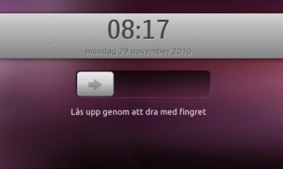
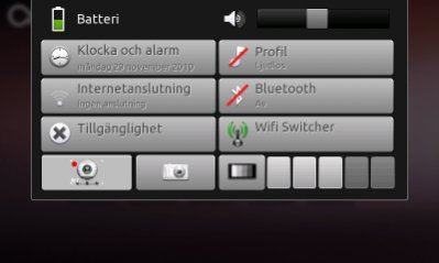
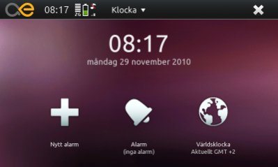
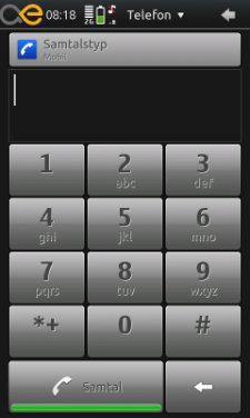
Things are humming along nicely. I didn't go to work today so, I made some tiny progress.
The result can be viewed below. With Actus reus, version Bona Fide.
Changes:
Ditched the droid font: replaced with Ubuntu. Clearer at small sizes and have a softer feeling. Get it here: http://font.ubuntu.com/
Added: Stylusbuttons.
Shaped up other buttons too.
Working Contacts-widget.
Another wallpaper and different backgrounds. Eg, lucid by Canonical.
New lockslide. It is awesomely wicked.
Shamelessly stole the setupwizard from humanity-theme.
Still need help with one thing before building an installable package. As you know the gtkrc is heavy modified, mostly to get the text-effect on buttons. But the effect is also applied in places where it looks really out of place. And also the volume indicator. So please, help me with this!


Get it here:
http://dl.dropbox.com/u/133178/actus...na_fide.tar.gz
Things are humming along nicely. I didn't go to work today so, I made some tiny progress.
The result can be viewed below. With Actus reus, version Bona Fide.
Changes:
Ditched the droid font: replaced with Ubuntu. Clearer at small sizes and have a softer feeling. Get it here: http://font.ubuntu.com/
Added: Stylusbuttons.
Shaped up other buttons too.
Working Contacts-widget.
Another wallpaper and different backgrounds. Eg, lucid by Canonical.
New lockslide. It is awesomely wicked.
Shamelessly stole the setupwizard from humanity-theme.
Still need help with one thing before building an installable package. As you know the gtkrc is heavy modified, mostly to get the text-effect on buttons. But the effect is also applied in places where it looks really out of place. And also the volume indicator. So please, help me with this!
Get it here:
http://dl.dropbox.com/u/133178/actus...na_fide.tar.gz
| The Following 11 Users Say Thank You to daddeddad For This Useful Post: | ||
|
|
2010-11-30
, 04:25
|
|
Posts: 343 |
Thanked: 165 times |
Joined on Sep 2010
|
#27
|
Very cool update. Looks pretty Ubuntu 10.10ish, which actually looks like Ubuntu (unlike the Humanity theme, which is just a few wallpaper and icon changes). Still holding out on the volume banner but it's not too important. Did a few mods like shrunk the "AE" for the task switcher by 33%, flipped a few gradients highlights so that the darker part is on top (looks flatter and inverted, I like it better - personal preference). Theme is great.
|
|
2011-02-02
, 13:13
|
|
Posts: 1,751 |
Thanked: 844 times |
Joined on Feb 2010
@ Sweden
|
#28
|
Have there been any progress on this theme?
__________________
You like what i do? Donate!
Make your desktop look awesome - use the AwOken Theme with the AwOken Icon Theme.
Add me on twitter @almehdin
Visit the swedish maemo/meego community forums
You like what i do? Donate!
Make your desktop look awesome - use the AwOken Theme with the AwOken Icon Theme.
Add me on twitter @almehdin
Visit the swedish maemo/meego community forums
|
|
2011-03-22
, 17:28
|
|
|
Posts: 238 |
Thanked: 291 times |
Joined on Mar 2010
@ London, UK
|
#29
|
Originally Posted by AlMehdi

I came across the very same issue as AlMehdi. Seems like the volume controls are completely back. I then figures that the main reason is coz of the banner wmBanner being made completely black. Unfortunately the volume speaker and bar are also black. So for the time being, i just copied the alphas wmbanner to the actus_reus -> Images folder and viola, i'm back in action... 
Thanks.. will do so. Even though it is not finished it looks awesome. By the way... are your volume notification working? Mine doesn't show.. i was wondering if it was my doing or if it already where like this...
 .
. Overall, this theme is a beauty and i think i am gonna do a few modifications myself to match my needs
 .
.Edit: I think its time I try what i can do in editing this theme to make a few variations here and there.
Last edited by fareed_xtreme; 2011-03-22 at 18:21.
| The Following User Says Thank You to fareed_xtreme For This Useful Post: | ||
|
|
2011-04-12
, 09:44
|
|
Posts: 458 |
Thanked: 136 times |
Joined on Jul 2010
@ Holland
|
#30
|
Can you replace the menu button with a "normal" icon instead of the maemo logo? Like this theme, is there also a deb installer?


wmLeftButtonEnd.png
wmRightButton.png
And I myself have been bugged by it.*I decreased the filling in a dumb way and the result is that the line is not a coherent 1px line but some 0.8px. The dropdown menus are made correctly. You might want to pay some intérest to wmEditModeButton* those are quite bad right now too.